Many of our customers ask us to adapt the design of their recommendation widgets. Normally they are using carousels to display their recommended items. We do this for free, but often have to explain what the rules of a perfect recommendations design supporting the conversion rate of the recommendations are.
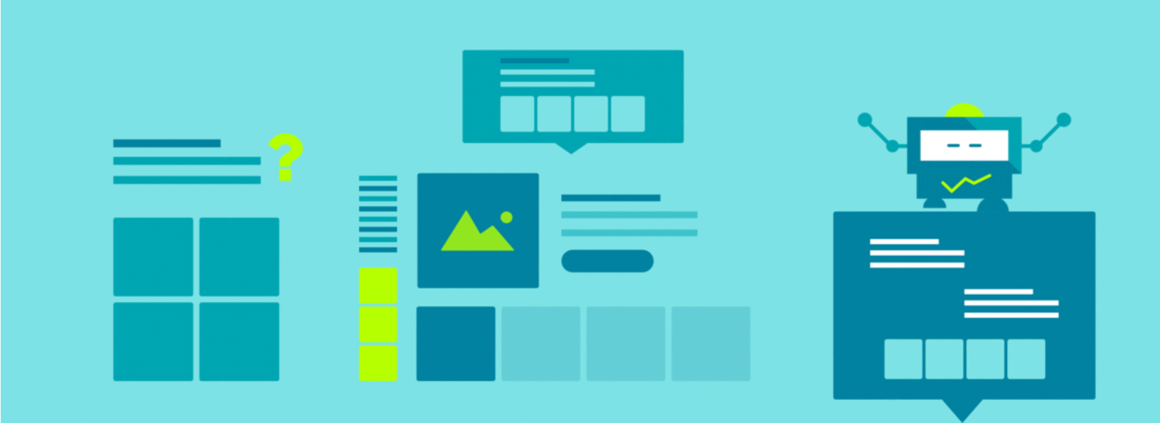
Here are the 5 golden rules for the perfect recommendations design.
Rule #1: Don’t Adapt Your Corporate Identity
If you just adapt existing elements of your current website or online shop, then your customers won’t be attracted by your recommendations. Don’t just adapt your CI, but create something new and design a new element, which sets itself apart of all your other website features.
Also think of your recommendation slots: the widgets won’t only be displayed on item detail or product pages. You can also add personalized widgets to all other kinds of pages: category pages, post pages, static landing pages, FAQ pages, your support area etc. Find more here. If the design just looks like everything else on your website, the visitors and customers won’t even recognize the new widget as personalized recommendations.
Rule #2: Be Different
Your recommendations should look different than your other contents. This is extremely important, but for many of our customers it is really hard to accept this. As described in the first golden rule, their corporate identity is above everything and may not be touched. But this is a clear fault: if your recommendations are not outstanding compared to e.g. manual recommendations, then your customers have to read through the titles of all your website elements to understand its contents. This is annoying for the customers.
So, just make it clear with a great design. Make your recommendations look different. Use different colors, font sizes or icons in the recommendations title to make it more attractive for your visitors.
Rule #3: Take it Easy
Many of our customers tend to perfectionism. One of the most important facts regarding a perfect recommendations design is, that you don’t have to pack all the features into the recommendation widgets that you have in your other web pages. Leave out: product ratings, additional images, complicated pricing calculations. An image and the title are enough. The recommendations are personalized and your customers will recognize this. They will be attracted by the recommendation content and not by the completeness of its product information.
Rule #4: Care for a Perfect Title
We’ve published a blog post regarding the perfect title of your recommendations. Work through this post to find a perfect title for your recommendations. This is not exactly part of the design of your recommendations, but influences the overall experience and visibility of your recommendation widget a lot. That’s why it has to be mentioned here
Rule #5: Prices Don’t Matter
At least in recommendation widgets!
Also a common issue for our customers is how to display the prices. Again, a thing of perfectionism and corporate identity: they want to display the most current prices and the prices must look like all the other prices on their websites. Think about the following: you display personalized content in the recommendation widget. Of course the price will have a big influence to the buying decision of the customer. But: the first and most important thing is, that the customer is generally interested in the recommended product. That’s why you don’t have to display prices at all! Many of our customers just hide the prices. All the complicated logics like daily prices, deal prices, scaled prices or configurable products with a minimum price are just very complex and not displayable in a recommendation widget.
It’s enough to explain these complicated logics on a product page and attract the visitor at first in the recommendation widget, which links to exactly that product page. What we’ve learned from the performance of our customers: displaying the price in a recommendation widget does not have any positive impact on the conversion rate of your recommendations. It’s actually the other way round: not displaying prices improves the click rate on the recommendations and your customers then at least have a detailed look into the description of the product on the product page. And then the chance of a conversion is much higher than the abruption because of a high price in the recommendation widget.
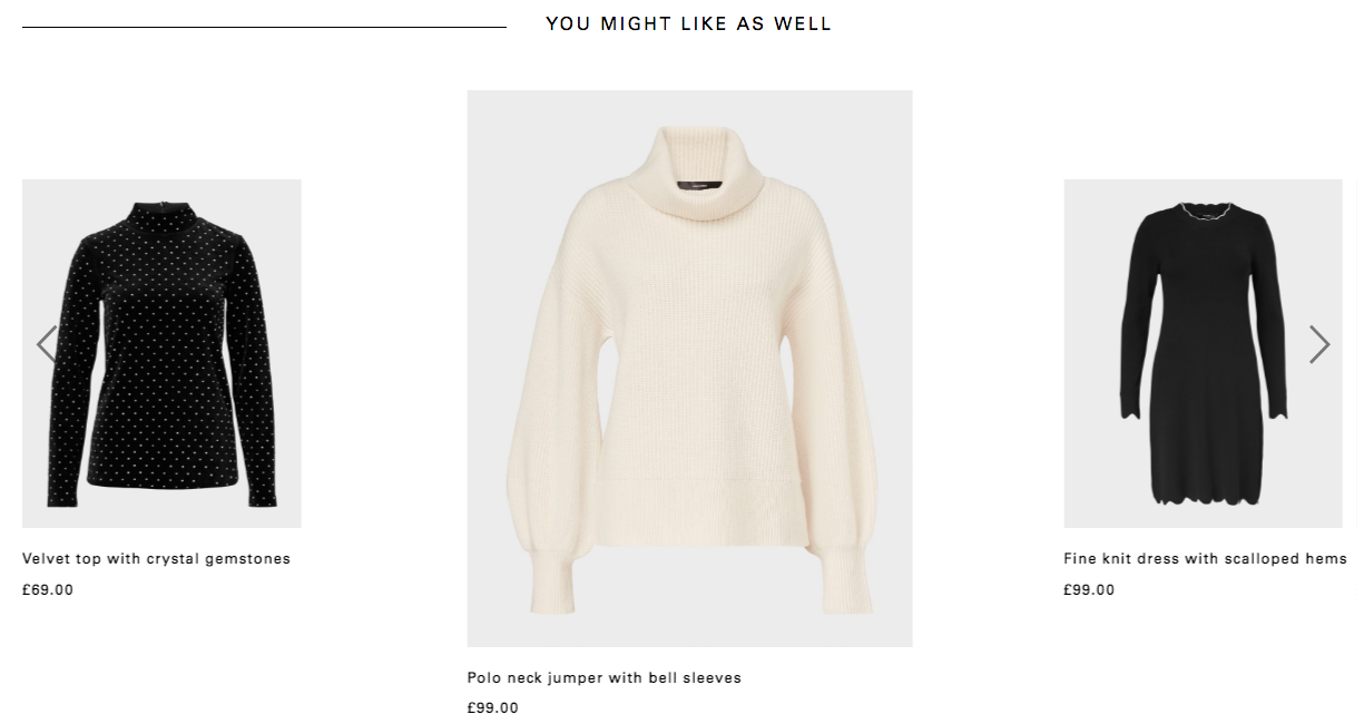
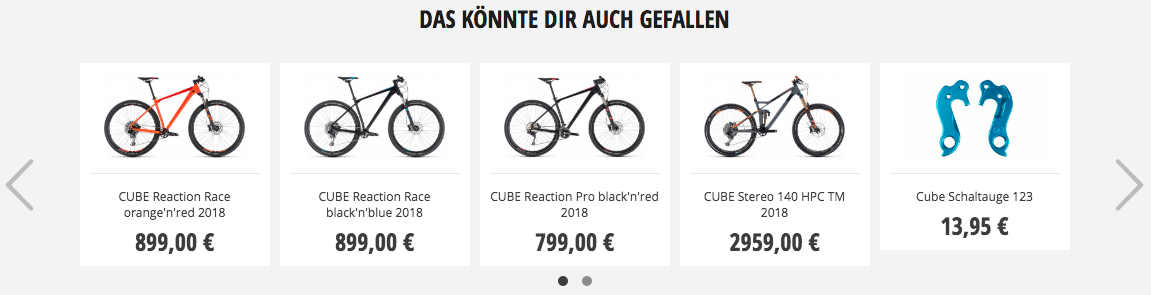
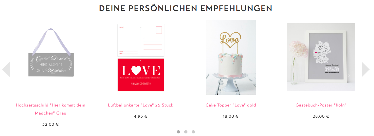
Examples of our customers
HALLHUBER
 RABE Bike
 Design-Grusskarten
What Can I Do?
As you can see in the above examples of our customers: they already have really great performances for their recommendation widgets. But they also tend to a perfect CI integration of the recommendations. So, there’s still lots of performance optimization potential for them.
Of course it is important, that the recommendation widgets fit into your CI. But it is even more important, that the content of these widgets increases the revenue and conversion rate of your website. Therefore one simple conclusion: your customers have to notice your recommendation widgets as recommendation widgets! And not as static content or enjoined content of you as a website owner.

